

Duration: 3 months Role: UX Research, Product Design
Quick Capture
TLDR: I had an idea to apply machine learning technology to a construction process where users have to create thousands of items. I also reimagined the item creation process from a form-based to a video-based experience that saved construction workers hundreds of hours, and eventually became a Top 20 initiative at the company.
The Problem
In June 2019 we went on a research and discovery trip related to an important project our team was working on. We were trying to better understand the process of a “Punch List” to optimize our Punch Tool for enterprise clients. A “Punch List” is the final walkthrough on a construction job site, where all the final improvements are documented and assigned to subcontractors.

Our team ended up designing an improved “Punch Workflow” process as a result of the trip. Still, for months I kept coming back to Jess, a project manager, telling me that she might document anywhere between 5,000 to 14,000 punch items on a large job site like a hotel or apartment complex.
5,000 of anything is quite a lot and I kept thinking how awful it would be to enter 5,000 items, descriptions, photos, assignees, and trades even into Procore’s “state of the art” punch tool. That’s tens of thousands of entries, and HOURS if not DAYS of Jess’ time.
Coincidental Connection
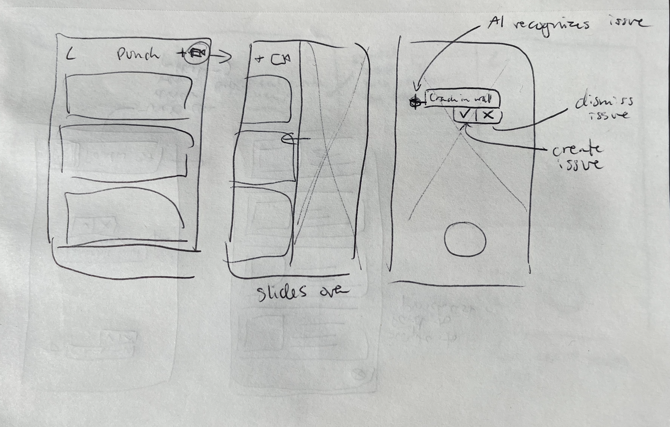
A few weeks after the trip I was walking through the office when I noticed one of our engineers playing with IBMs Watson AI program. Interested, I asked Yury about what he was doing. He told me he was trying to train the AI to recognize construction “issues” such as cracks, wires, electrical switches, etc. And then I thought of Jess! What if instead of her having to walk around, type out, and take photos of all the construction issues, she could just walk around with an AI-enabled video that would automatically recognize these issues and turn them into Punch items! Procore’s platform could further apply ML to fill out the necessary fields and send out the items to workers for completion.
This wasn’t on our “roadmap”, but excited about the technology and potential impact on all users of the Punch tool I wrote up a quick message to the Director who came with us on the initial discovery trip.

Hacking A Prototype
The idea never made it onto our team’s roadmap, but a few months later Procore hosted its annual hackathon. I brought up the idea to the team and they felt it would be a fun project to try to hack together in a couple of days. It wouldn’t have all the functionality, but it could get at least a part of the way to illustrating how game-changing this would be for Punch managers. Worst case, it was a fun mobile project we were excited to try and build.
As a team we identified the core problem:
“It takes too long to enter Punch Items into Procore’s app”
And we began ideating the best way we could tackle this problem in 3 days. Some of the ideas included:
Apply AI image recognition to photos in the camera roll that would recognize, suggest, and create punch items.
Have AI suggest punch items live as the user scans a room with video, allowing the user to “tap-to-confirm” issues.
Apply speech-to-text technology and auto-populate relevant fields with information extracted from the text.
Use QR codes to quickly apply the Location field of an item.
Rethink the Punch tool as “photo-centric” rather than “form-centric.”
We didn’t have enough time to fully design and build out all of our ideas so we had to prioritize what would make the most impact and create a strong foundation for any potential future work.
Our team loved the idea of a “photo-centric” punch tool, meaning the user would create Punch items primarily from the camera, rather than filling out a form and later attaching images. We also really wanted to apply some AI to our project and decided to try to populate some of the fields for the user. Given our limited timeframe, it was easier to apply machine learning to text than to photos. We settled on having the user verbally describe the issue on video. Then the ML could extract the images and necessary information.
The Prototype
During the hackathon we were able to build out a prototype that met a lot of our original criteria. We focused on creating a camera-first experience, and allowed the user to record items while describing them verbally. We then used speech-to-text and Machine Learning technology to extract key frames from the video and populate form fields based on what the user described. We were able to populate Types of issues, assign Trades, populate Titles and Descriptions, and even assign Assignees using machine learning.

Some of the features the original prototype included that we would redesign later:
Back navigation
Black borders
Review items
Record button
Onboarding information
Timer
Stakeholder Buy-In
The prototype presentation went great, and even the CEO got excited about the idea of how much time it could save workers in the field. The hackathon effectively allowed us to get the green light for some lightweight user testing to see how much difference this product would make. Quick Capture still wasn’t an official project, but our PM was able to reach out to some customers to have them try out the product.
We ended up enabling and onboarding 100 users to the experience through test flight. The data we collected was amazing as those users ended up creating thousands of punch items and were able to do so about 3 times faster than through the regular experience!
“This is great! I was able to make 200 punch items in under an hour!”
“We’ve got 560 locations on our project, so this will be a huge time saver. Especially with the QR code functionality.”
“I love that I can quickly say everything that needs to be done to fix an item. It lets me be much more detailed without requiring me to type out all the information in the template!”
With the data and the enthusiasm expressed by the early participants we were finally able to get the project on the roadmap, and I was able to devote more time to improving the UX and integration of Quick Capture into the existing Punch Tool. I partnered on this with another UXer on our team as I was still overseeing the development of the ITPs tool.
Upgrading the UX
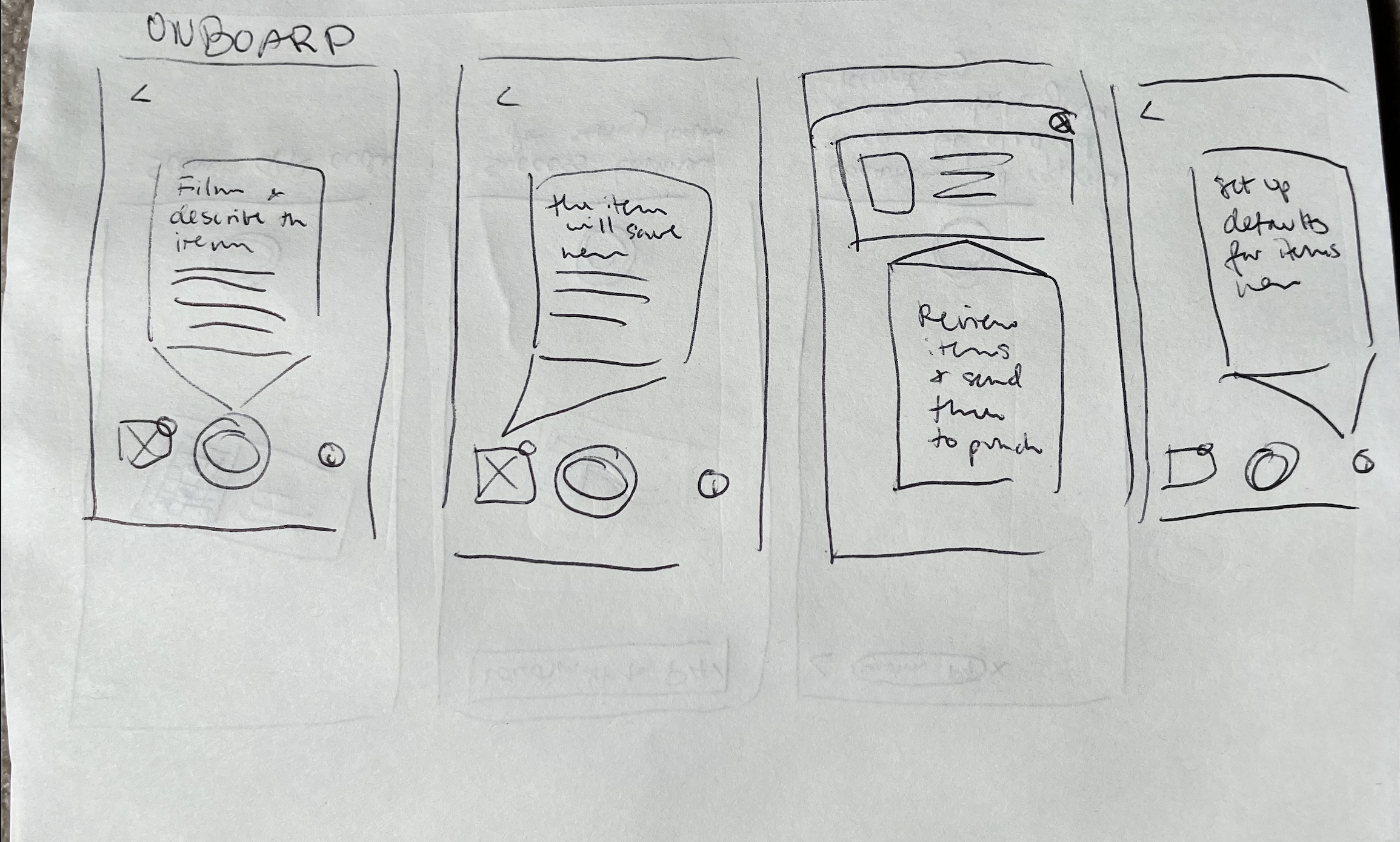
We received a lot of enthusiasm about the Quick Capture feature, but we already had some upgrades on our radar. We wanted to give the UI a facelift as it was just hacked together in 3 days. We also wanted to improve adoption and usage. While onboarding our test flight users we saw some initial confusion as the item creation experience was so different from anything we had in Procore. Thus, we redesigned the onboarding into 6 explanatory screens and had it pop up as soon as the user opened the new experience.

We also made improvements to the rest of the UI in order to help users understand and navigate creating Punch items with the new experience.

Surfaced the Punch item location visibility at all times.
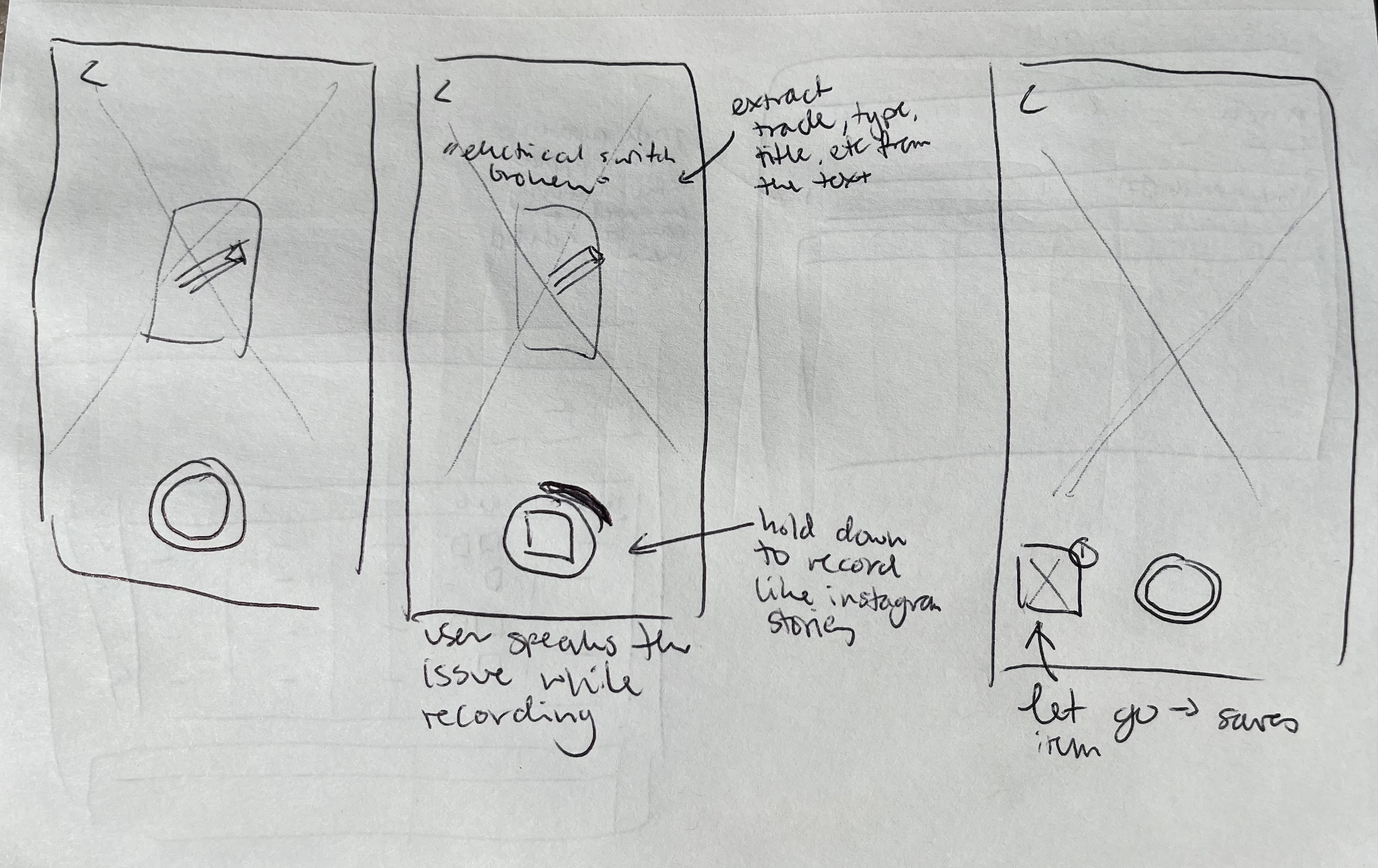
Extended the camera screen to maximize the recording area.
Changed out the info icon to house additional punch tool settings and fields.

Shortened the timer amount to prompt users to keep videos brief, as their devices may not have enough storage for hundreds of long videos.
Improved accessibility of the stop recording button which also counts “down” for a visual indication of time left for recording one punch item. Due to engineering constraints, we set the time limit to 60 seconds.
When the user starts recording the defaults buttons disappear to focus the user's attention on recording and saving the recording when complete.

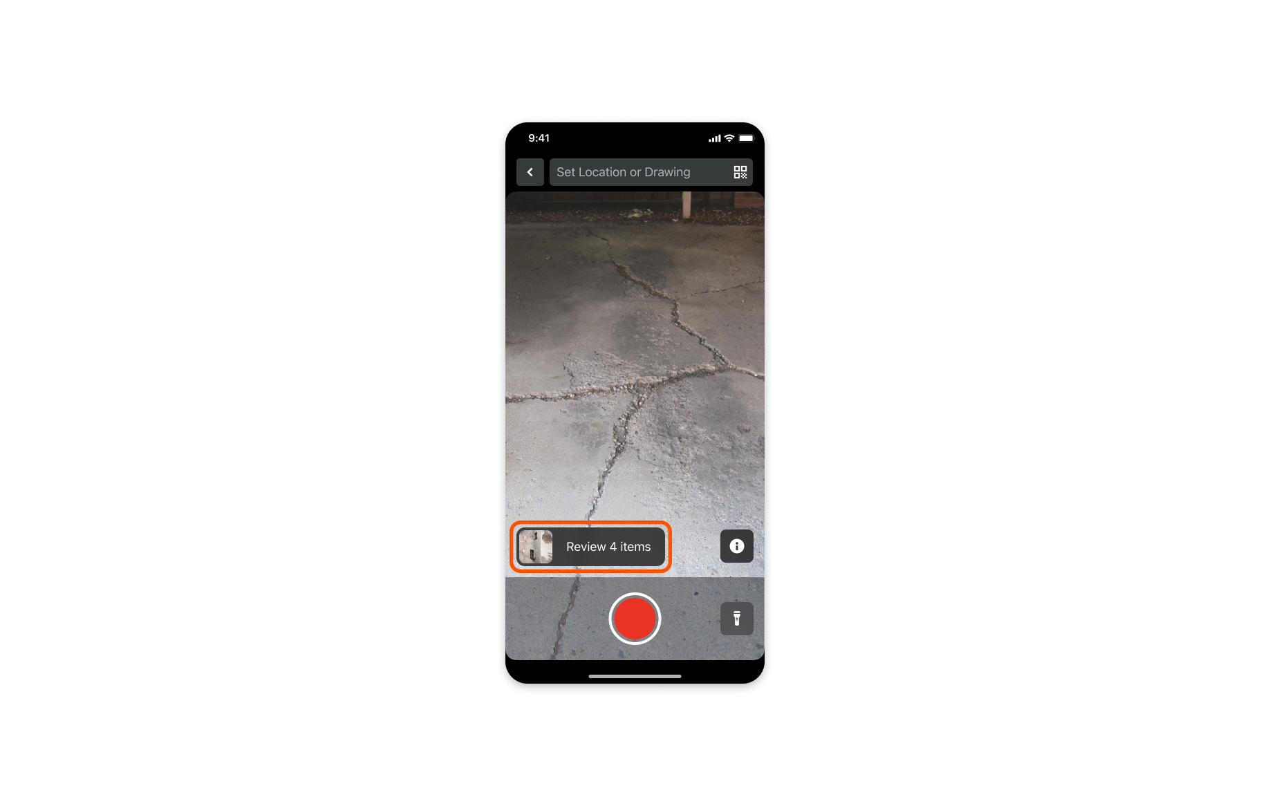
Added a visual indicator of where recorded items are stored for review.
Other icons reappear once recording stops
Setting Defaults
We also wanted the experience to have all the normal functionality of the Punch Tool so that the user didn’t miss anything they were used to from the old experience. We decided to make the most important setting of Locations always present and easily editable. All of the other settings were included within the settings icon. We also designed the settings to “carry over” to the next item so that the user could only set them once during a punch session

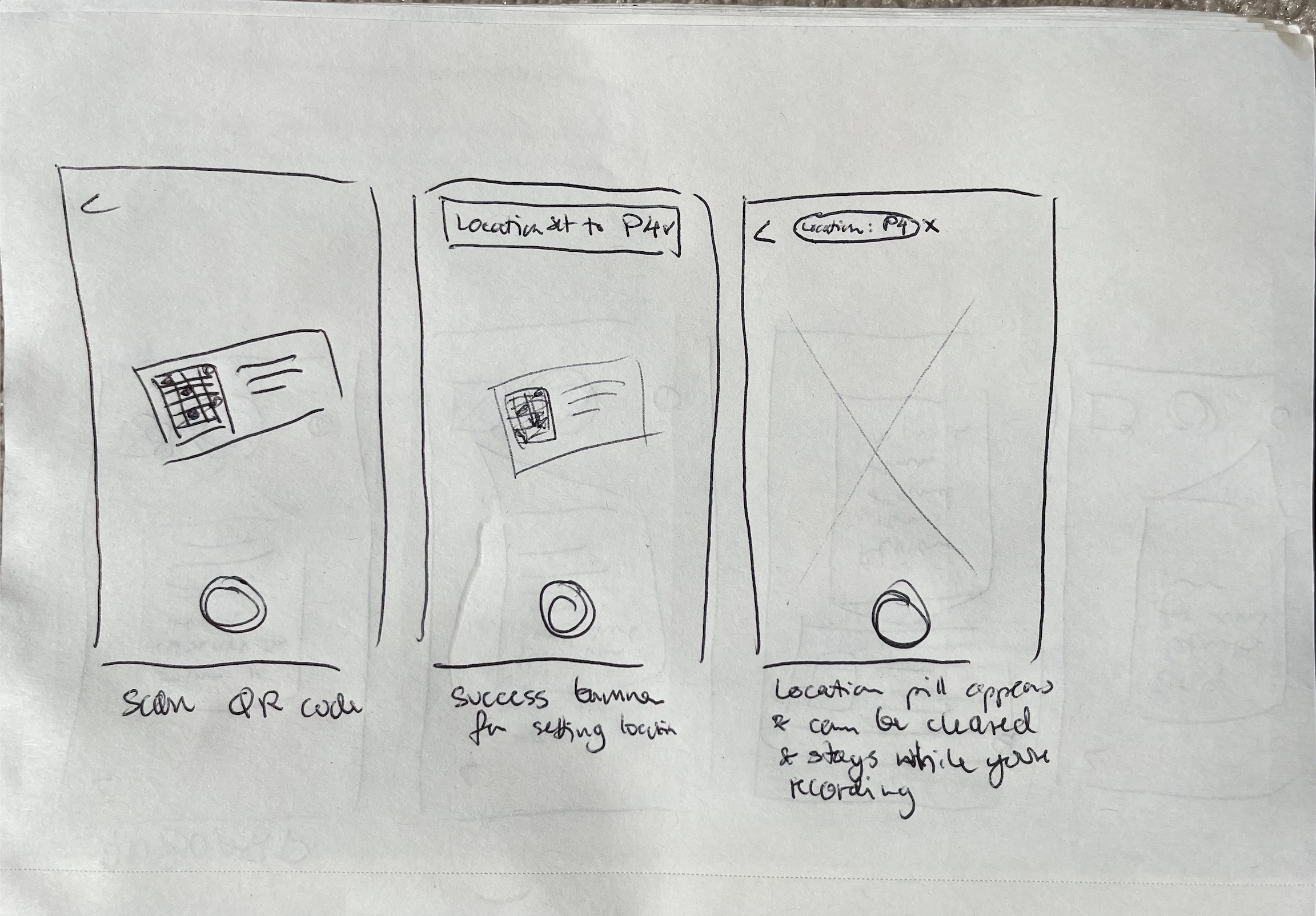
Added a button to manually edit location and make it visible throughout the experience for less tech-savvy users, or those who did not use QR codes on their job sites.
Kept the QR Location experience for power users to quickly change locations.

The location appears here once updated. Also opens the defaults drawer if tapped for easy editing.
The “i/settings” button also opens the settings drawer for managing location and other fields.

Surfaced required fields and allowed users to “set and forget” them for the upcoming list of Punch Items to be created.
Allowed editing of location from the settings screen.
Added an option to re-enter the onboarding walkthrough if the user forgot how to engage with the experience.
Review Flow
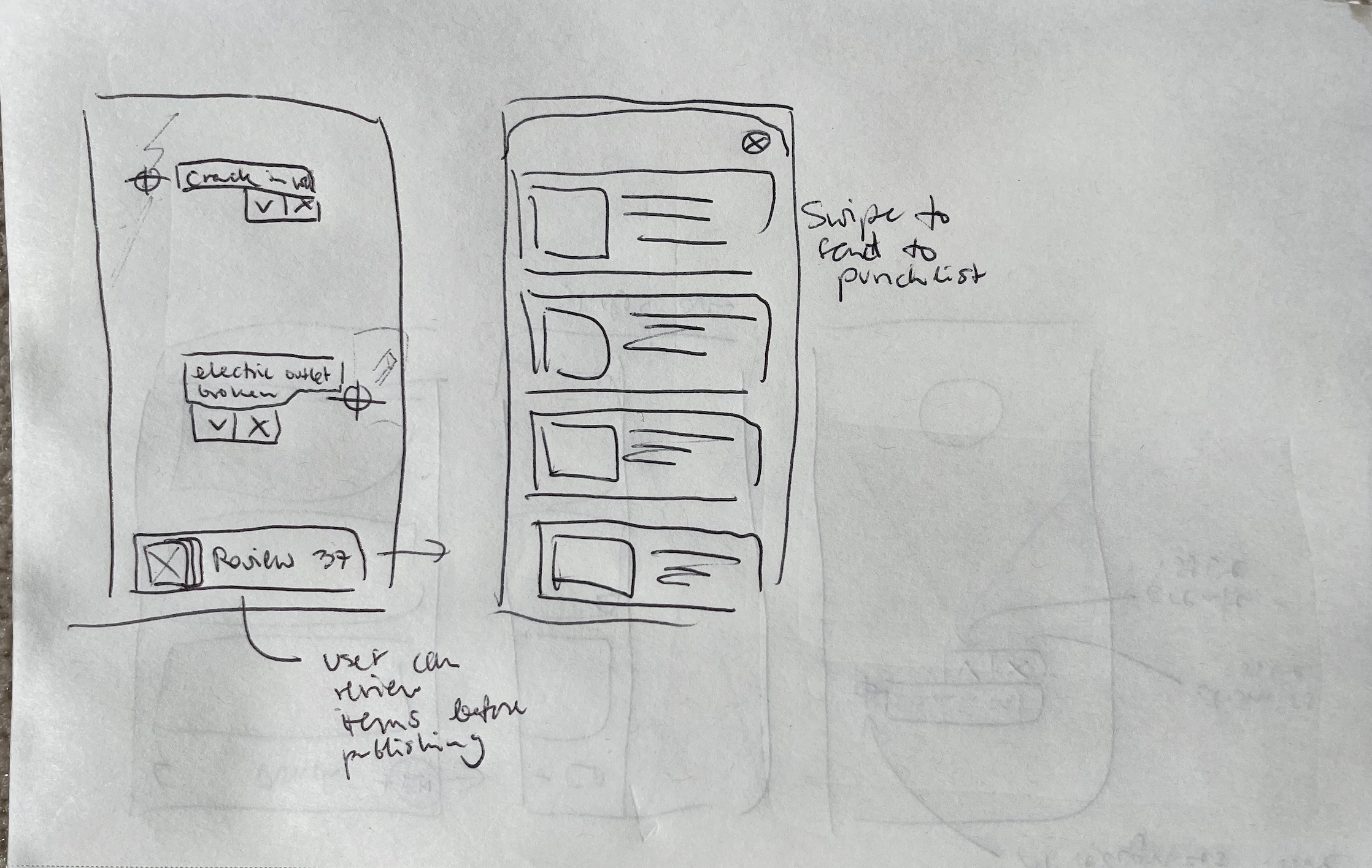
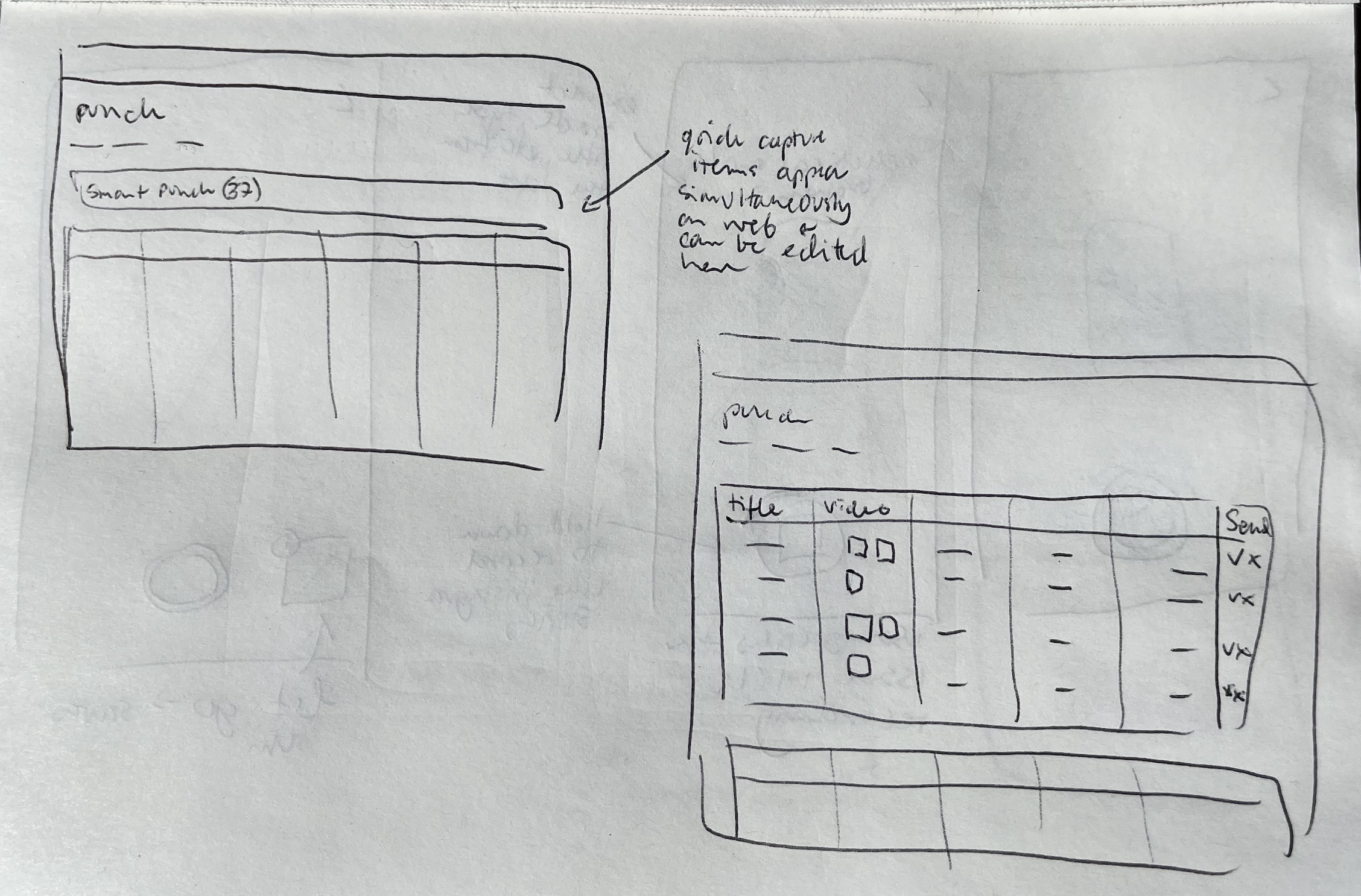
Once all the Punch Items have been captured the user can enter the review process by clicking on the tile icon. We additionally added the image of the latest item to the button to visually indicate to the user that the created items were being stored for Review
Next, the user can review the items one by one and add any additional information directly from their device. However, hearing from users about the number of items they are reviewing, it made sense to review these items in bulk on the computer. Thus we added the ability to bulk send all created items to the Punch List.

Within an individual item, the review process was very similar to the old experience. We added a camera icon to further signal that the user could take additional snapshots of the video that they captured. We also had some additional ideas for a built-out video viewing experience down the line.

A major addition to the experience was the inclusion of the required punch fields. Now users could review these main fields on the go, without overwhelming them with too much information.
We also added a Delete and Save button to allow for making changes and going back to the list of all captured items. We felt these functions were important for letting the user know whether their edits have been saved. And we prioritized these actions over the individual sending of an item, which previously occupied this space. We also had plans to add the ability for individual sending with a swipe action from the main item list view.

Entry into the Experience
We also wanted to integrate the new experience more seamlessly into the existing Punch Tool. This would help users understand the types of items the experience was geared at, and further help the initial onboarding.
For the hackathon, we added another icon to the list of Procore tools, but it didn’t effectively communicate that the experience was part of the Punch Tool. We wanted to make the new experience primary to creating new Punch items.

Unfortunately, at the time of development, the Punch Tool had not yet been rebuilt with the new system components. Thus, we could not easily integrate the above design direction and had to find another way to steer users to the new experience, while preserving the option for creating a Punch item in the old way. We settled on the drawer accessed from the “+” create button that users were used to clicking. In the drawer, we gave dominance to the “Quick Capture” button to get more people to try out the new experience.

Future Improvements
Victor and I also began thinking about the experience on the web, but we didn’t have enough engineering resources to build it out for Alpha. We wanted the Punch items to be automatically visible on web and mobile as soon as they were created. This would allow the user to make corrections on either platform, before adding the items to the official punch list that owners and other stakeholders could see. Due to our resource constraints, we had to put off the web improvements until a later release.

Additionally, we had a list of some’ nice to have’ mobile interactions that we also descoped, but included the designs for, just in case our engineers found the time to build them out.

With the added Bulk move feature, we felt that it was more of a “nice to have” to be able to move items to the Punch list one at a time, so we redesigned it as a slide feature.
Slide to Delete was already an existing feature and we kept it on the list page for power users who may not want to go into each item individually to delete.
To play back a Quick Capture video on mobile the user had to go into the attachments and find the video attachment to open the playback screen. We wanted to bring the video playback directly into the main carousel so the user could tap to view the video from there.
Post Alpha
June 14, 2021 - SVP of Product calls out Quick Capture as the 14th most important initiative in the company
June 28, 2021- Quick Capture goes into Pilot
Feb 16, 2022 - Quick Capture enters official Beta with 150 companies
April 5, 2022 - Training of sales teams on quick capture begins